Actionable Alerts: No more digging through data r-daniel tells you what’s important today.
Stay Ahead: Get a bird’s-eye view of performance and potential risks with daily updates.
Personalized News: Customized insights based on your specific business goals and KPIs.
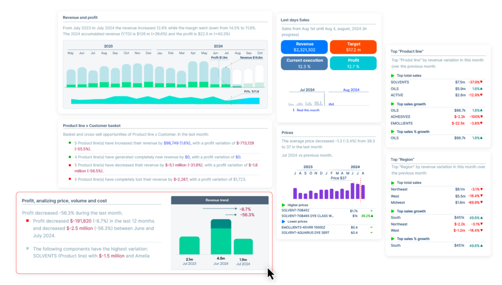
When something catches your eye in the newsletter, r-daniel allows you to dive deeper into specific insights. Whether it’s a sudden drop in sales or an unexpected rise in customer churn, you can seamlessly move from an overview to a detailed analysis.
Deep Discovery: Click on any insight to explore the underlying data and patterns.
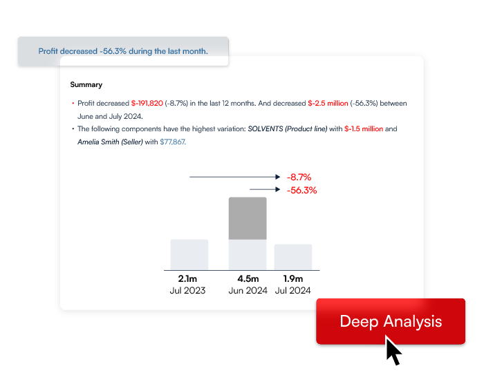
Identify Root Causes: Go beyond the surface by pinpointing key drivers like price changes or volume shifts.
Interactive Data: Dynamic dashboards let you filter, sort, and drill down into what matters most.
From high-level trends to granular details, uncover the ‘why’ behind every number.
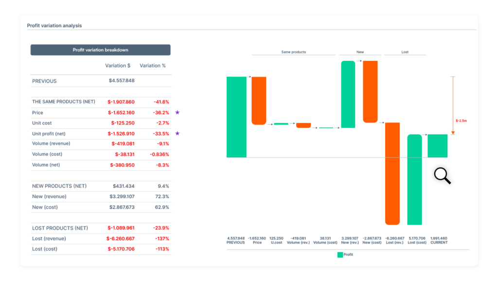
Now that you understand the insights, r-daniel helps you translate that knowledge into action. With intuitive visualization tools, r-daniel presents the data in a way that’s easy to digest, allowing you to make fast, informed decisions that can improve your business outcomes.
Decision Support: Compare multiple scenarios side-by-side to weigh the pros and cons of each choice.
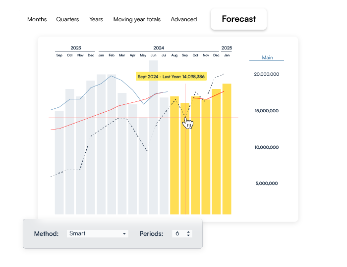
Tailored Visuals: Graphs, charts, and dashboards are customized to help you make sense of complex data.
Make data-driven decisions with confidence, knowing r-daniel’s insights are guiding every step.
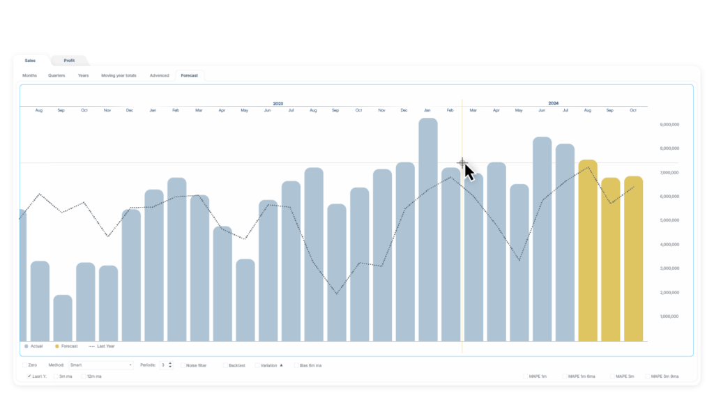
Once you’ve executed your strategy, r-daniel tracks the results and shows the impact. With powerful infographics and trend analysis, you can measure how your decisions are affecting the business in real time.
Visualize Success: From profit trends to customer satisfaction, watch your strategy unfold visually.
Infographic Tools: Use interactive solar charts, comparison tables, and growth graphs to monitor improvements.
From high-level trends to granular details—uncover the ‘why’ behind every number.
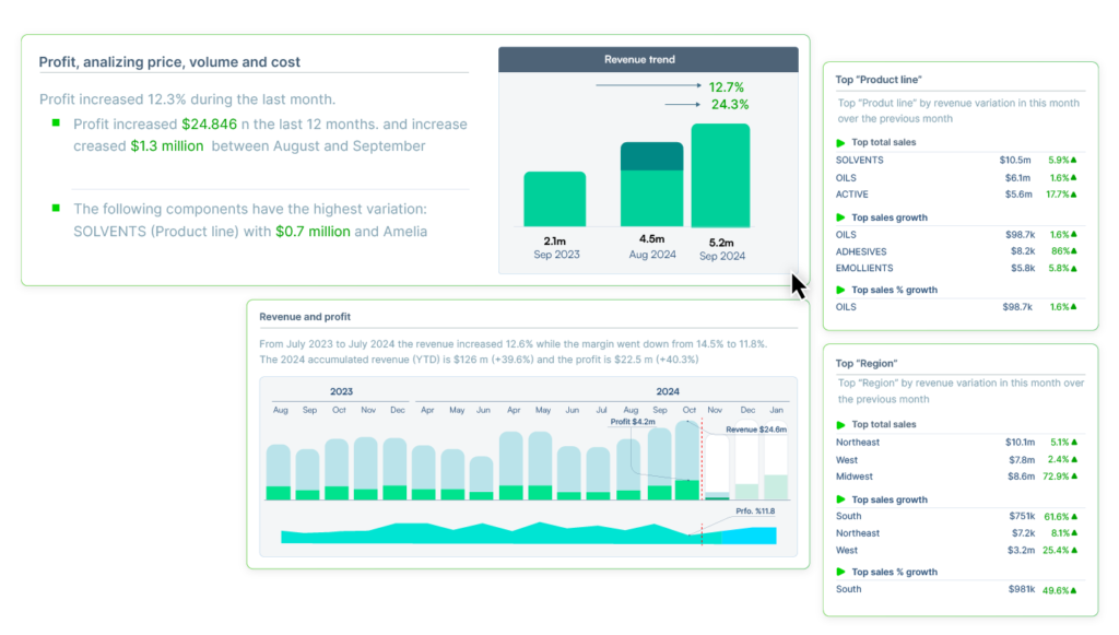
Join the ranks of businesses that have supercharged their growth with r-daniel
r-daniel’s Deep Discovery goes beyond traditional analytics, scanning millions of data combinations to find insights hidden beneath the surface. It automatically reveals trends, risks, and opportunities without the need for manual analysis.
AI-powered analysis of millions of business scenarios.
Discover hidden patterns across multiple data dimensions.
Let r-daniel do the heavy lifting while you focus on decision-making.
Discover insights that traditional tools miss.
Get proactive alerts before issues escalate.
R-Daniel’s suite of Powerful Infographic Tools turns complex business data into clear, interactive visuals. Whether you’re tracking performance, comparing strategies, or deep-diving into customer behavior, R-Daniel’s visualizations empower faster, data-driven decisions.
The Solar Graph gives you an instant view of the relationship between key metrics, like sales and profitability, across time and different business dimensions. The sunburst-like visualization helps you drill down from high-level insights to specific data points.
The Whale Graph is designed to show cumulative profit over time, identifying the most profitable customers or products. It’s perfect for visualizing profitability distribution and spotting where profits are made—or lost.
The Whale Graph is designed to show cumulative profit over time, identifying the most profitable customers or products. It’s perfect for visualizing profitability distribution and spotting where profits are made—or lost.

With R-Daniel’s Heat Graph, you can see data intensity visually, revealing trends, risks, and opportunities based on data concentration. This heat map helps you understand which areas of your business are performing well and which need attention.
The 1000-in-1 Graph enables you to visualize thousands of data points within a single graph, allowing for hyper-dimensional analysis across multiple metrics, products, or customer segments simultaneously.

The 1000-in-1 Graph enables you to visualize thousands of data points within a single graph, allowing for hyper-dimensional analysis across multiple metrics, products, or customer segments simultaneously.

Track and visualize profit margins across different products, regions, and customer segments with the Margin Graph. It helps you see where your profits are highest and identify where improvements can be made.
Want to book a trial or simply get in touch? Drop us a message, and we’ll get back to you.
You can always reach us through our contact email.
All rights reserved r-daniel 2024